This week I have carried on with the modelling of the character
For the beard I have edited some of the folds that I had previously created to make the crease blend on the surface rather to have it from edge to edge
This week I have also carried a little experiment to create a projection mapping starting from a drawing of a potential environment I have created according to my storyboard.
In the past week I had the chance to catch up on the Fourtiche studio animation Arcane league of legends. What strikes me the most is the texturing style they have employed in the series where 2D and 3D are merged and almost impossible to distinguish.
Especially for characters, which are 3D, their texture was created to make them appear as if they where 2D or hand painted which is something I would like to achieve for my character for my final year project.
In this corridor crew episode they go through the style and animation technique they employed for the show and it was useful to get some insights.
This video explains how they used realistic painting and projected environments for the show instead of 3D objects: I was thinking that for some scenes in my final year project I could use projection mapping for the environments especially where not many camera movements are involved.
the person in this videos tries to reproduce the lighting that they applied for the character texture in the show
projection mapping
Projection mapping is also an option I am considering to apply for the environments: my idea is to draw myself the backgrounds and the props to then project onto a 3D surface so to get the hand drawn effects I am looking for
As I mentioned before this is what they used for the environments of the show Arcane and in the following video the person shows how to replicate this process.
substance designer
this substance designer has a plug-in that transforms images into paintings: this could be useful for the self portrait of van gogh
I have created the definite pair of eyes which would be composed by the cornea, which would be transparent and the actual eye which will have the texture with the iris and the pupil
both the eyes and the ear at that point were not correct: the way I had moved the vertices around in the preview mode were not correct; the ear conformation was wrong too. For both I deleted some edges so that I could start again.
for the character clothes I have followed a similar process: have the faces distributed evenly on the surface and always try to keep the faces with four edges.
I have continued the process of inserting edge loops and adjusting the vertices to maintain the shape of the face: when moving the vertices I would always use keep the mesh on preview mode and after I would switch to smoothed to see how it collapsed.
At this point the head is starting to get to the right shape: I would always work on one side, except for when using both side is more convenient, to get a symmetrical model in the end.
I have then mirrored the model so to see if everything was right: the nostril are probably too big, the forehead too pronounced and the cheekbones and the mouth need to be adjusted as well.
This week I have created the storyboard which helped me visualise the idea and clearly convey how the story will flow, as you can see how the shots work together. It also allowed me to see potential problems that would not go unnoticed saving me time. (how long the informations should be displayed or in which form -letters-; find the meaning of the actions and the reason to include them in the animation).
How to structure the change in direction around the face with the edge loops.
The face has a lot of twists and turns in terms of his muscle structure and the way it goes around the face. These changes are represented by five stars poles around the structure of the face and generally are in these locations: the tip of the nose bridge, the corner of the eye on the outside, the middle of the cheek, the point in which the nose meet the cheek and the upper cheek bone. All these points represent the changes in direction of the musculature of the face around the eye as it transitions into the cheek, the jaw, the nasolabial crease and the mouth(pentagonal shape around the eye: within the pentagon you end up with continuous loops to fill out the upper cheek the lower brow and the eyelids). For the mouth there is a similar process: there is a star near the change of the direction of the musculature near the jaw and the mouth. (an additional loop around the eye can help when rigging for smiles, working as an intersection in the change of direction between the cheeks, the forehead and the mouth. For the mouth, is good to have one edge loop that goes over the nose and around the chin to form the nasolabial crease. Is important to have level of symmetry throughout the structure of the upper and lower lids. the area of the eyelids has four general quadrants: so the upper left, the upper right the lower left and the lower right (same for the lips). Around the cheeks is where you get a mesh like structure, uniform across the board with no loops. There is an overall loop the travels around the face to frame the jawline and the forehead. The amount of spans between the lower and upper eyelids and lips has to be even to make rigging easier. There should not be any stars in the centre of the face. In the lips there is a loop that follows the nasolabial crease of the face, inside of that there are some infinite loops that sits within that nasolabial crease to form the lips. There is also an identical amount of spans on the top and bottom of the lip travelling up the nose to the skull and the polygons can be reduced at the base of the skull as the topology is built.
key loops in the face: eyes, muzzle. mouth the perimeter of the face. It makes it easier to connect the dots. Loops should be symmetrical vertically as well as horizontally.
https://www.youtube.com/watch?v=3L8eZAwmG2E
In the following images I have tried to plan the key topology points of my model face:
In order to get the 2D style I am looking for to render the images for the animation I have carried some research on other films that involve this technique.
Since Robin Williams’ character is a fan of impressionistic paintings, he imagines an afterlife created by brushstrokes.The visual effects for the painted world of What Dreams May Come would take the concept of optical flow – where every pixel is tracked in a moving image – to new levels in order to turn liveaction scenes into paintings in motion.
In the following paper is discussed a software that the authors developed to create impressionist style of painting starting from “normal” images. Using a region based approach allows them to create out-put images in which the style of the brush strokes varies radically depending on the region. This is a feature some-times seen in Van Gogh’s paintings, it is particularly re-markable in landscapes such as Starry Night and someof his self portraits. Background regionsare filled with long curling strokes arranged in turbulentpatterns, while a more conservative style is used in ar-eas of greater detail.
sharing insights over the paintings of the artist will be an important part of the animation. the letters are going to be a crucial part: using some of his words as well. The overall animation is going to deal with is last years in the south of France his mental health and artistic development. All the artworks I am going to recreate in 3D are going to be from this period and are somehow intertwined with each other.
Paintings in arles I am going to include as well as some initial research I have found where I have found very useful information
Sunflowers
These were painted to decorate the spare bedroom at the Yellow House, to welcome the arrival of Paul Gauguin.
Van Gogh started his series of Sunflowers on Monday 20 August 1888 and finished on the Friday
Differently from what happened in the 15th and 16th centuries, Van Gogh with his several self-portraits didn’t want to celebrate his image or his role of artist, but rather tries to describe on canvas his own personality and his sufferings.
Each self-portrait by Van Gogh might be linked to a precise moment in his life, but the element common to all is that in every painting the face and the background are the key to observe what is hidden in his mind.
Actually, the artist is interested in what those eyes hide and each self-portrait need to be admired in its entirety, because the background and his facial features are a whole with what Van Gogh tries to express.
the contrast between the apparent calm of his face and the swirling lines of the brushstrokes.
There’s a contrast between the vortexes of colours and the expression of his face so still and restrained. It seems that the artist is imposing strict discipline on himself, which however explodes in his way of painting.
“I don’t know anything with certainty, but seeing the stars makes me dream.” Vincent van Gogh
The painting is based on van Gogh’s view from his room in the mental asylum at Saint-Rémy-de-Provence. It was painted from memory during the day, as he was not able to paint from his room. But he was able to create sketches in ink and charcoal.
Although it is one of his most famous works, he initially considered the painting to be a failure based on his letters to Theo.
In a letter to his brother Theo, van Gogh wrote that the “starry night is more alive and more richly colored than the day”. This may explain his exaggerated use of of color.
this painting marks an interesting area somewhere between realism and complete abstraction. Van Gogh pushed the colors and style in order to depict his unique interpretation of the world, but not so much as to lose all qualities of realism and representation. You know exactly what the subject is, but it is far from what you would see in life.
This area in painting allows for some personal expression, without departing too far from representational art standards.
He then relaxed by temporarily abandoning his studio for a shopping expedition in town. Although notorious for his shabby clothes, he returned with “a black velvet jacket of quite good quality for 20 francs” (a surprising purchase in the sweltering heat)—and a large yellow straw hat. Both items may appear to be hanging behind his bed in the painting he made of his bedroom two months later.
After two years in Paris, Vincent van Gogh moved to Arles in southern France on February 20, 1888. He rented a room in the Carrel Hotel-Restaurant where he would stay for three months. In May he moved to a room on the top floor of the Café de la Gare. At the same time, he rented the four-roomed Yellow House in the Lamartine Area and began using it as a workshop He settled entirely in Yellow House in September.
Van Gogh invites his painter friend Gauguin to work together in Arles. Theo van Gogh, who runs a gallery in Paris and sells both his brother’s and Gauguin’s works, works to fulfill this request.
Van Gogh wrote the following letter to Theo concerning this painting depicting his bedroom while he was waiting for Gauguin to come:
“This time it’s simply my bedroom, but the color has to do the job here, and through its being simplified by giving a grander style to things, to be suggestive here of rest or of sleep in general. In short, looking at the painting should rest the mind, or rather, the imagination.”
“The solidity of the furniture should also now express unshakeable repose.“
“I’ll work on it again all day tomorrow, but you can see how simple the idea is. The shadows and cast shadows are removed; it’s colored in flat, plain tints like Japanese prints.“
The painting was a reflection of a completely colored feeling. The subject was the bedroom, the motif was rest… But all the items in the bedroom are placed in order to create a strong perspective effect. Half the window is open, sloping furniture, pictures hanging on the walls, it gives an impression as if dangling into the room, this gives the picture a tension. The effect of loneliness and abandonment in the picture outweighs the demands. This unusual perspective practice was not only the conscious personal choice of Van Gogh. The architectural structure of the room was also influential in this. The room had an unusual curvature formed by two walls with 120 and 60-degree angles.
It didn’t take long for their joint work to cause their distortion. Their close relationship of two months ended when Van Gogh cut his left ear as a result of the crisis. Gauguin left Arles. Van Gogh had voluntarily entered himself at Saint Rémy’s Saint-Paul-de-Mausole asylum after he was hospitalized in Arles.
Clearly Van Gogh was pleased with his work. He created five different versions of his bedroom, 3 in oil and 2 in letter sketches. The 3 paintings vary only slightly in minor details.
After Vincent’s suicide his doctor, Paul Gachet, drew a simple tribute—a poignant single sunflower
Dr Paul Gachet was at Van Gogh’s beside for the two days from 27 July 1890, when he shot himself to his death following two days later. Three weeks afterwards, Dr Gachet—an amateur artist—visited Theo in Paris, presenting him with a symbolic drawing inscribed “Le Tournesol” (The Sunflower). This poignant sketch has not been widely reproduced. That month, Dr Gachet planted sunflowers on the grave. For those close to Vincent, the flower that turns towards the sun had already become inextricably linked with the artist whose career was cut short in his prime.
I have set a Miro board where I will include the most important milestones I achieve throughout the creation and development of the project. It will also work as a conceptual map to see everything together, to see the big picture, helping me chunk information based on meaningful connections.
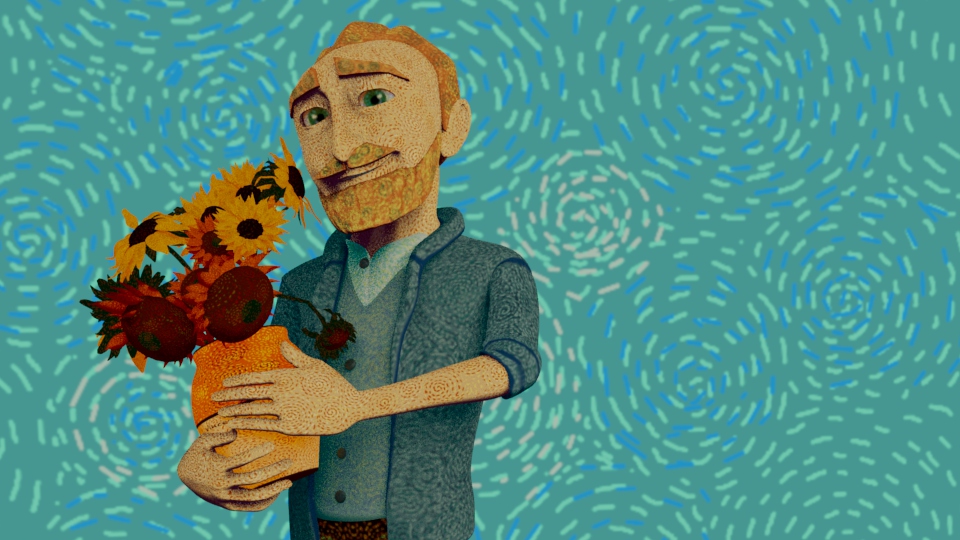
The character of Van Gogh will be a crucial aspect of the animation. At first I had considered downloading a rig and edit the physical features to make it resemble Van Gogh which would have allowed me to focus more of the animation rather than rigging the character. Although I think that I can only benefit from practicing on modeling, rigging and texturing for a model, especially when the character requires a specific look such as mine.
I first identified his main features: the self-portrait were extremely useful for this.
problem with how big the space is and the camera movement to frame everything
I have created a proxy as a stand-in for an asset in your scene. This is useful to temporarily simplify complex scenes by substituting simpler geometry while still allowing me to work with an asset’s published attributes.
using your voice in the argument how to show the reader what you are thinking what your views are and how you have engaged critically with the topic being discussed.
the argument can help you plan the structure of your work and guide to find the evidence you need to support it
sum the argument in a few word before staring writing and keep it the focus of the writing
developing an argument: state your contention, identify the important reasons pf the argument, identify possible objections, research evidence, structure it so that the points logically link up to the conclusion, state your conclusions.
include different premises, objection and final contention
identify the gap in the literature
check the integrity of claims
analysis and summary are very different:
summary: identify ideas and present them again in a more concise way.
analysis: reach your own conclusions and create something that may not be evident at first glance.never use loose or vague references
how will I create the discussion for my thesis? (themed chapters)