Starry Night model

In order to start modeling the starry night painting I first looked for some online references of other artist that attempted this. This 3D version of the painting is going to be shown at the end of the animation and has to fit with the rest of the animation style. As it is now I have thought about two ways with which I could interpret the painting: model it or using camera projection from a drawing that I will make to follow the style of the animation. I will try both and see which one works better.

The following are some examples of other artist who revisited the painting in 3D:

A Korean 2D & 3D motion graphic designer – Kim Gryun has shared his amazing work which inspired by Vincent Van Gogh. He selected ‘Van Gogh’s Bedroom at Arles’ and ‘The Starry Night’ to make a realistic rendering with Octane Render in Cinema 4d and some post production with After Effect. As you can see in the video the sky which is the less realistic part is slightly moving which is something I would like to incorporate in my model.

Vincent Van Gogh’s Starry Night Painting turned into a VR diorama. what I like from this interpretation are the bright particles in the sky which give a “magical” vibe and vibrancy to the whole artwork.

The interesting thing about this artwork is the use of perspective that the artist made as well as the fact that the stars and the moon in the sky are painted as independent parts. The colour rendering is also very nice since the artist added some grain to add a halo on the artwork

The work by this artist is interesting as well: each main section of the painting has been separated from the rest to create depth and movement to the artwork, in my case I could create a 2D artwork inspired by the painting and separate the different parts to create perspective as well since that the camera will not have to navigate through the artwork oppositely to the other artworks in the animation.

sky motion effects

I thought I would start by creating the 3D assets as part of the composition just like I did for the other paintings.

I started out with the tree model from a cone polygon and adding subdivisions and tying to simulate the tree shape.

Afterwards I have applied the texture as well.
Notes on “Vincent Van Gogh: a life in Letters”

His letters convey the artist’s personal ideas and emotions in such a compelling way that they attain the universality of all great literature. He showed his vulnerability by asserting ideals, by getting into arguments, and by sharing with the reader his outrage, his melancholy, and later his mental illness. The letters tell the story of his eventful life, detailing his close ties with his brother Theo, and the evolution of his artistic skills. It is the insight they give us into the development of a ground-breaking artist–a man who did not hesitate to show his most human side–that make these letters so fascinating.

With hindsight it can be said that he developed as an artist with amazing speed: it took him only ten years to draw and paint the extensive oeuvre that would make him world-famous.

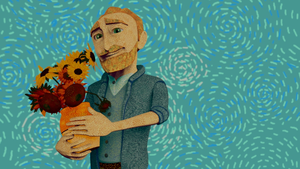
Vincent had green eyes, a red beard and freckles; his hair was ginger-coloured like that of his brother Theo, his junior by four years. He had a facial tic, and his hands seemed to be in constant motion.

Don’t imagine that I think myself perfect–or that I believe it isn’t my fault that many people find me a disagreeable character. I’m often terribly and cantankerously melancholic, irritable–yearning for sympathy as if with a kind of hunger and thirst–I become indifferent, sharp, and sometimes even pour oil on the flames if I don’t get sympathy. I don’t enjoy company, and dealing with people, talking to them, is often painful and difficult for me. But do you know where a great deal if not all of this comes from? Simply from nervousness–I who am terribly sensitive, both physically and morally, only really acquired it in the years when I was deeply miserable. (244)

Theo supported Vincent through life’s difficulties and acted as a buffer between him and the ‘hostile world’ (406).

After a stay of two years, Van Gogh needed to escape his life in Paris: the artistic quarrels of the city’s avant-garde circles, his often strained relationship with Theo, and the bohemian lifestyle that was damaging his already fragile state of health.

Whenever Van Gogh moved, his first letters give a vivid impression of his new surroundings, and Arles was no exception. He thought the landscape and the inhabitants exceedingly picturesque, but life was not going to be as inexpensive as he had hoped.

any praise or sign of recognition caused him to retreat, as though he were afraid of falling into a trap and losing his independence.

Vincent meanwhile had rented a small house on place Lamartine in Arles. At first he used his ‘yellow house’ only as a studio, but he began to see it as a means of realizing his dream of working together with Paul Gauguin in Arles. In this Studio of the South they would be able to strike out on the path to the future of painting: collaboration and solidarity.

Van Gogh began his preparations in a spirit of hope. He furnished his house as their living quarters–which put considerable strain on Theo’s budget–and decided to decorate it with paintings, turning it into a true artists’ house. In these very months–the summer and autumn of 1888–Vincent created a series of works, which are now icons of modern art: sunflowers in a vase, a café at night, numerous portraits, park views and his bedroom. He was at the height of his powers, and he knew it. This demanded the utmost of him, both physically and mentally.

During a spell of bad weather, they worked together in the small studio in the Yellow House, where Van Gogh, who always based his works on reality, obeyed Gauguin’s mantra to work from memory and the imagination. They also discussed art and literature, of course, and the fundamental differences in their artistic notions became increasingly clear. The low point came on the evening of 23 December, exactly two months after Gauguin’s arrival. In the Yellow House, Van Gogh cut off his ear, which he brought to a prostitute in the nearby red-light district. He was taken to a hospital the next morning. Theo, who learned of the incident from a telegram sent by Gauguin, set off that same evening for Arles to be with Vincent. One day later–on Christmas Day–Theo returned to Paris with Gauguin. The dream of a shared studio, which had briefly come true, was now shattered.

I’m also convinced that it’s precisely through a long stay here that I’ll bring out my personality. (referring to the south of France)

the effects colours produce through their harmonies or discords should be boldly exaggerated. It’s the same as in drawing—the precise drawing, the right colour—is not perhaps the essential element we should look for—because the reflection of reality in the mirror, if it was possible to fix it with colour and everything—would in no way be a painting, any more than a photograph.

Painters—to speak only of them—being dead and buried, speak to a following generation or to several following generations through their works. Is that all, or is there more, even? In the life of the painter, death may perhaps not be the most difficult thing. For myself, I declare I don’t know anything about it. But the sight of the stars always makes me dream

Animation style moodboard and sunflower model and texture update

In order to visualise better the animation style I have created this “moodboard” where I have merged together the coloured painting and the sketches version of the painting. I will use this “sketching scenario” when I will share information over the artist or the painting the sketch is about.

I have also started uv mapping the sunflower models using an automatic mapping and applying the photoshop texture afterwards.

the final effect I wanted to achieve is the same of the painting where the vase would stand against the blue background (which I have used for the room wallpaper)

week 19: Project developments- compositing

Miro Board Link:

https://miro.com/app/board/uXjVOKHnfj0=/?share_link_id=371325218573

This week I have finalised the compositing stage.

For the first shot to add an introduction effect I have duplicated the trees for the background and positioned them in the foreground to give and impression of depth and animated them so that the more the camera pan closer to the character the trees would go out of the frame.

For the skeleton fish scene I had already added a fisheye effect in maya although I wanted to accentuate this effect even more so I have created a black solid layer with a mask set on subtract and feathered the edges to make the boarders even darker.

As I mentioned last week the depth map I have rendered was not working well since the gradient look very similar in the background and the foreground. So I have created a black solid layer and applied to it a gradient map to select the area affected by the blur. On top of it I have created an adjustment layer with a camera blur effect applied to it and the black solid layer selected as mask.

compositing with sounds

After I have composited all the different shots I have added sounds to them based on the animatic.

This week I have also made the intro in 3D since I have thought that the 2D version of it was not fitting with the style of the entire animation. I have used the fishing rod model from the animation and created a 3D text and parent it to the bait.

In order to make the animation more visually interesting I have added some 2D graphics:

some depression lines

comic text which I took inspiration from the deadpool video game showcasing the time and indicate the time spent waiting.

Moreover I have added some stars animation when he wakes up after he felt trying to catch the fish.

for some of the most crucial transitions in the animation I have created a comic slide transition to highlight the actions showcased in the scenes.

Week 18: Project developments

Miro Board Link:

https://miro.com/app/board/uXjVOKHnfj0=/?share_link_id=371325218573

Once I had rendered the animation I started the compositing stage both in Nuke and in After Effects. Both had this colour issues with the beauty layers of the render layers.

The problem was related to the beauty and alpha channel that I had previously rendered separately. In After effects I have positioned the different layers in the following way to make it work: the physical sky ate the bottom followed by the beauty from the master layer and the alpha channel from the master layer. the beauty mode should be set to alpha matte in order for the alpha to mask the black background and show the physical sky beneath.

the picture here showcases the nuke viewport in this case the merge node was acting as screen mode so the opacity of the layers above would appear with a lower opacity. However if I first merged the alpha channel and the beauty layer from the the master layer first and after create an additional merge node connecting those two with the physical sky, they would appear normal.

This week I also created the intro for the short animation. I first created the illustrations and text using illustrator so that they would be vector drawing and the quality world be high, and after I have imported the different assets in after effects to animate them accordingly to the animatic.

In order to add a depth to the scene especially for the trees in the back ground I have done a research looking for a way to render a depth map in maya. One way of doing it is to ad the Z render pass in the render settings. Once the image is rendered it can be imported in after effects although it would first appear as completely white. Once an exposure and levels effects are applied to it it would show a greyscale of the rendered image with the darker values being those in the foreground and the lighter values behind those in the far back.

This is the depth map from the first scene. Although, as you can see, the difference of foreground and background is not that evident so once I have linked it to the beauty layer effect “camera blur” in after effect it would all appear as blurred in the same way and the foreground and the background would not be differentiated.

water reflection

Unfortunately the water in some shots I had previously rendered appeared with a weird reflection especially when the waves faced directly the sun which came across as unnatural. At first I thought that the physical sky might have caused it although I compared the scenes where this did not happen and the values for the physical sky were the the same. The difference was is the water shade and specifically the colour and the IOR values so I have set all the scenes with this problem using the following settings.

color correction

Once all the rendering were ready I started to composite each shot. Other than the alpha channel the beauty of the master layers I also overlaid the AO layer to it which gave a nice shadow effect to the items in the scene. to the beauty I have applied a hue and saturation and exposure effect to the ao a gamma effect.

clouds

While compositing I felt that the sky was a bit “empty” and that adding some clouds would add some depth as well to it. So I looked for some clouds obj on turbosquid By VARRRG and I found these which are a bit stylised and fit with with the overall style of the animation.

Week 16: writing approaches

support your arguments by adding substance and evidence.

show you have researched widely and know about specialist are of interest.

incorporating other people’s work into your own written work: paraphrasing, summarising, synthesising, quoting.

show how the information you found has helped you to develop your arguments, ideas and opinions.

paraphrasing pitfalls: describing an author’s idea but not explaining the significance to your own argument, or the point that you are trying to make; providing too much detail; not distinguish the author’s point and your own viewpoint.

summary pitfalls: providing too much detail unnecessary background informations; describe the author’s idea but not the significance to your own argument.

synthesise pitfalls: not distinguishing clearly which viewpoint belong to which author; not grouping relevant authors or point together; describe the author’s idea but not the significance to your own argument.

quote pitfalls: using to many quotes; incorporating a quote without describing its relevance to the argument

be concise: one idea per sentence; sentences to a reasonable length 25 words; avoid repetitions.

avoid redundant words: use because instead of due to the fact that for instance

use hedging words: this suggests, it is possible that, a possible explanation, usually, sometimes, somewhat, in what appears to be, it may help, he claims.

boosters: express a measure of certainty or conviction, clearly there is a strong correlation

tips to developing an academic argument.

Week 16: Project developments

Miro Board Link:

https://miro.com/app/board/uXjVOKHnfj0=/?share_link_id=371325218573

While experimenting with the character textures I thought I could apply to him a toon shader which would fit much better with the overall tone of the short film given the whole story a comic vibe. I have first followed this video:

I selected all the different parts of the model and created a toon shader for each of them and is the result:

Although, since I am using arnold to render this type of shader is not compatible to it and resulted to a matte texture with no edges at all:

I looked more into it and found out that there is an aitoonshader which is compatible with arnold:

I have added a base colour with a ramp setting for the shading of each texture

The edges also appeared more subtle which were less overwhelming compared to the first toon shader

I had to set the filters to contours in order for the edges to appear

when working on the original file I was using a skydome as a light. However in the animation scenes there is a physical sky which is simulating an early morning light, so there is not much light in the scene which made the shadows of the different aitoown shadows the only thing to be seen.

I tried to edit the physical sky setting which made some improvements:

I also applied the toon shader for the other props present in the animation:

Light developments

these are the physical sky setting that I have used in order to make the lighter parts of the aitoonshader appear as well:

Animation

In the meantime I also carried on the animation process and this following videos shows the progress I have made on a specific scene where I worked on the timing and spacing of the animation to make it more believable and natural as possible:

Week 15: AR workshop

This week workshop was related to Unity and Vuforia (AR)

Vuforia is an augmented reality software development kit for mobile devices that enables the creation of augmented reality applications. It uses computer vision technology to recognize and track planar images and 3D objects in real time.

The Engine detects and tracks the image by comparing extracted natural features from the camera image against a known target resource database. Once the Image Target is detected, Vuforia Engine will track the image and augment your content seamlessly using best in market image tracking technology.

In Unity I have created the vuforia ar camera using the image target downloaded from vuforia and positioned on top of it in the viewport the useless machine animation and put as an output the usb camera and I have then used my phone with the target image and the animated object appeared on top.

Week 14: Project Developments

Miro Board Link:

https://miro.com/app/board/uXjVOKHnfj0=/?share_link_id=371325218573

This week I have worked on a walk animation for the fisherman. Even though he won’t walk during the animation I thought that creating one would give me a better idea of how to frame and identify his personality which will have a big impact on the overall animation. In the walk I also added some props such as the fishing rod and the bucket where he supposedly puts the fishes (when he manages to catch any). I consider the fishing rod as the secondary character for this animation, as a sidekick even, aiding the protagonist as they work to achieve a goal (catch any fish), overcome an antagonist (an apparent big fish difficult to catch), or undergo necessary internal development. The mood I tried to achieve for him is grumpy but comic, funny and laughable at the same time since he is quite small and even his clothes are a bit over size for him. I would like fro the audience to emphasise with him and his struggles to a catch a fish.

I have playblast a the animation from side, front and 3/4 point of view which I will edit together for the final process video for the project.

Texturing

In the different rendered frames I have created in Maya so far I have noticed that the texture especially for the clothes of the character seems to be pixelated so I am planning onto edit the texture in substance painter to get a better result as well as increasing the sampling in the camera settings.

the rendered picture as it is now

Animation

For the overall animation process I am noticing that the timing is one of the biggest issues I am encounting throughout the process: since animation is a time-based medium, developing a good sense of timing is very important to creating good animation. Timing is what gives meaning to the motion. The speed at which things happen affect the perception of the scene and give it mood.

Timing has a huge role to play in how your animation will look like. If your timing is really fast or slow, too linear or too long, the overall animation will end up looking unrealistic. Timing is dependent on speed and you can interpret someone’s current state with it. Which is why in the future for the animation I will try to record myself and use it as a reference.

Week 13: Introduction to lighting in Arnold notes

sampling

sampling= refinement by subdividing and recalculating

better sampling refines colours and their definition

In Arnorld we can edit the samples in different areas

In Arnolds Control samples in light systems (smoothing out the shadows)

The higher the sample level is the higher the render is

There are two lighting systems, Maya and Arnold

Maya System

lights:

point light, a point of light

directional light, a parallel rase mimicking the sun, its position is irrelevant only its rotation counts, it has sharp shadows

spot light, like a lamp

area light, a card of light, it ha softer shadows

in each light the following settings are for:

exposure, increasing it would be like opening the aperture on a camera, allowing more light into the scene

radious, spreads out shadows reducing their sharpness to clean up the render the samples are increased (1-5)

shadow density, makes the shadows more translucent

visibility shadows, light contribution to the scene

colour temperature, change light temperature (5000 early morning)

intensity, should always be kept on 1 as default

In the directional light attributes there are slightly different options as well as those mentioned above: the angle option is used to soften the shadows

For the area light: resolution helps sharpen the shadows and spread takes the area lights and spreads the lights

Spot light roundness option shapes the radius and penumbra angle and drop-off soften the circle of light

Arnold system

the lights have more realistic effects

area light more physically accurate

skydive light, a sphere which lights the whole scene

mesh light, a piece of geometry that can be turned into a light

photometric light, reproduce real world accurate light (with value input)

light portal filters physical sky and skidoo to clean up

physical sky, mimics the physical sky and system reproducing the lighting during the time of day

area light has less burn out and works better with arnold render

light filters

light blocker it creates a transform node

AI standard surface to render the scene in Arnold

Lambert transparency activate opacity to make it work turning on space to use the transparency setting to make an object transparent

standard surface lighter

IOR each object has and index of refraction which indicates ho light interacts with it and then bends

Base settings

colour: a diffuse colour

weight: light absorption

diffuse roughness: distribution of light across the surface

metalness: reflectivity of the object

Specular settings

roughness: specular quality across the object (it activates with the meatless of the base settings. geometry tab opacity turned down as well.

IOR: each object has and index of refraction which indicates ho light interacts with it and then bends

Anisotropy: micro groups for highlighters

Rotation: to rotate the anisotropy

Transmissions settings

it affects the transparency

depth and scatter: retrain the amount of light passing through the object (less opaque)

dispersion abbe: imperfections in glass

extra roughness: rough the transmission

Emissions settings

replicates the incandescence

Coat settings

a layer of specular across the surface that mixes with the specular settings. used in a car paint and skin (the oil on the skin)

Subsurface settings

allows light to pass through the surface to hit the internal parts of it to their subspaces

scale: to decide the depth of the surface beneath

radius: to edit the scatter