In the past week I had the chance to catch up on the Fourtiche studio animation Arcane league of legends. What strikes me the most is the texturing style they have employed in the series where 2D and 3D are merged and almost impossible to distinguish.
Especially for characters, which are 3D, their texture was created to make them appear as if they where 2D or hand painted which is something I would like to achieve for my character for my final year project.
In this corridor crew episode they go through the style and animation technique they employed for the show and it was useful to get some insights.
This video explains how they used realistic painting and projected environments for the show instead of 3D objects: I was thinking that for some scenes in my final year project I could use projection mapping for the environments especially where not many camera movements are involved.
the person in this videos tries to reproduce the lighting that they applied for the character texture in the show
projection mapping
Projection mapping is also an option I am considering to apply for the environments: my idea is to draw myself the backgrounds and the props to then project onto a 3D surface so to get the hand drawn effects I am looking for
As I mentioned before this is what they used for the environments of the show Arcane and in the following video the person shows how to replicate this process.
substance designer
this substance designer has a plug-in that transforms images into paintings: this could be useful for the self portrait of van gogh
I have created the definite pair of eyes which would be composed by the cornea, which would be transparent and the actual eye which will have the texture with the iris and the pupil
both the eyes and the ear at that point were not correct: the way I had moved the vertices around in the preview mode were not correct; the ear conformation was wrong too. For both I deleted some edges so that I could start again.
for the character clothes I have followed a similar process: have the faces distributed evenly on the surface and always try to keep the faces with four edges.
I have continued the process of inserting edge loops and adjusting the vertices to maintain the shape of the face: when moving the vertices I would always use keep the mesh on preview mode and after I would switch to smoothed to see how it collapsed.
At this point the head is starting to get to the right shape: I would always work on one side, except for when using both side is more convenient, to get a symmetrical model in the end.
I have then mirrored the model so to see if everything was right: the nostril are probably too big, the forehead too pronounced and the cheekbones and the mouth need to be adjusted as well.
This week I have created the storyboard which helped me visualise the idea and clearly convey how the story will flow, as you can see how the shots work together. It also allowed me to see potential problems that would not go unnoticed saving me time. (how long the informations should be displayed or in which form -letters-; find the meaning of the actions and the reason to include them in the animation).
How to structure the change in direction around the face with the edge loops.
The face has a lot of twists and turns in terms of his muscle structure and the way it goes around the face. These changes are represented by five stars poles around the structure of the face and generally are in these locations: the tip of the nose bridge, the corner of the eye on the outside, the middle of the cheek, the point in which the nose meet the cheek and the upper cheek bone. All these points represent the changes in direction of the musculature of the face around the eye as it transitions into the cheek, the jaw, the nasolabial crease and the mouth(pentagonal shape around the eye: within the pentagon you end up with continuous loops to fill out the upper cheek the lower brow and the eyelids). For the mouth there is a similar process: there is a star near the change of the direction of the musculature near the jaw and the mouth. (an additional loop around the eye can help when rigging for smiles, working as an intersection in the change of direction between the cheeks, the forehead and the mouth. For the mouth, is good to have one edge loop that goes over the nose and around the chin to form the nasolabial crease. Is important to have level of symmetry throughout the structure of the upper and lower lids. the area of the eyelids has four general quadrants: so the upper left, the upper right the lower left and the lower right (same for the lips). Around the cheeks is where you get a mesh like structure, uniform across the board with no loops. There is an overall loop the travels around the face to frame the jawline and the forehead. The amount of spans between the lower and upper eyelids and lips has to be even to make rigging easier. There should not be any stars in the centre of the face. In the lips there is a loop that follows the nasolabial crease of the face, inside of that there are some infinite loops that sits within that nasolabial crease to form the lips. There is also an identical amount of spans on the top and bottom of the lip travelling up the nose to the skull and the polygons can be reduced at the base of the skull as the topology is built.
key loops in the face: eyes, muzzle. mouth the perimeter of the face. It makes it easier to connect the dots. Loops should be symmetrical vertically as well as horizontally.
https://www.youtube.com/watch?v=3L8eZAwmG2E
In the following images I have tried to plan the key topology points of my model face:
In order to get the 2D style I am looking for to render the images for the animation I have carried some research on other films that involve this technique.
Since Robin Williams’ character is a fan of impressionistic paintings, he imagines an afterlife created by brushstrokes.The visual effects for the painted world of What Dreams May Come would take the concept of optical flow – where every pixel is tracked in a moving image – to new levels in order to turn liveaction scenes into paintings in motion.
In the following paper is discussed a software that the authors developed to create impressionist style of painting starting from “normal” images. Using a region based approach allows them to create out-put images in which the style of the brush strokes varies radically depending on the region. This is a feature some-times seen in Van Gogh’s paintings, it is particularly re-markable in landscapes such as Starry Night and someof his self portraits. Background regionsare filled with long curling strokes arranged in turbulentpatterns, while a more conservative style is used in ar-eas of greater detail.
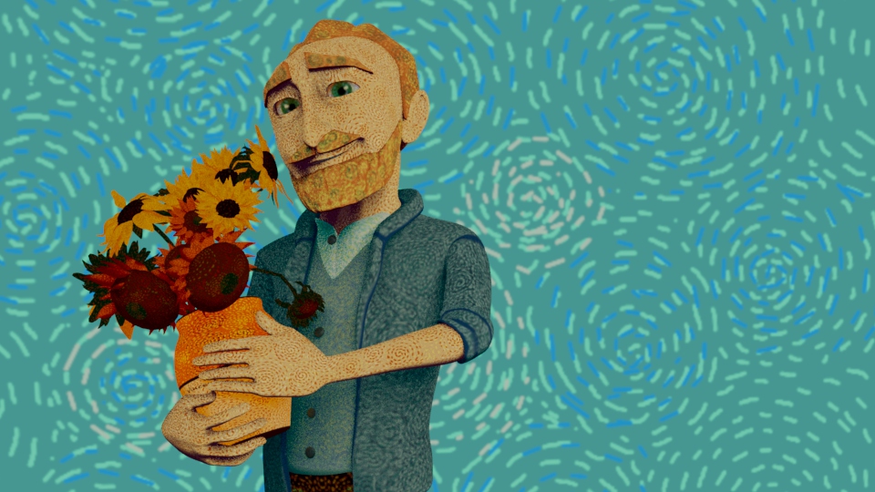
sharing insights over the paintings of the artist will be an important part of the animation. the letters are going to be a crucial part: using some of his words as well. The overall animation is going to deal with is last years in the south of France his mental health and artistic development. All the artworks I am going to recreate in 3D are going to be from this period and are somehow intertwined with each other.
Paintings in arles I am going to include as well as some initial research I have found where I have found very useful information
Sunflowers
These were painted to decorate the spare bedroom at the Yellow House, to welcome the arrival of Paul Gauguin.
Van Gogh started his series of Sunflowers on Monday 20 August 1888 and finished on the Friday
Differently from what happened in the 15th and 16th centuries, Van Gogh with his several self-portraits didn’t want to celebrate his image or his role of artist, but rather tries to describe on canvas his own personality and his sufferings.
Each self-portrait by Van Gogh might be linked to a precise moment in his life, but the element common to all is that in every painting the face and the background are the key to observe what is hidden in his mind.
Actually, the artist is interested in what those eyes hide and each self-portrait need to be admired in its entirety, because the background and his facial features are a whole with what Van Gogh tries to express.
the contrast between the apparent calm of his face and the swirling lines of the brushstrokes.
There’s a contrast between the vortexes of colours and the expression of his face so still and restrained. It seems that the artist is imposing strict discipline on himself, which however explodes in his way of painting.
“I don’t know anything with certainty, but seeing the stars makes me dream.” Vincent van Gogh
The painting is based on van Gogh’s view from his room in the mental asylum at Saint-Rémy-de-Provence. It was painted from memory during the day, as he was not able to paint from his room. But he was able to create sketches in ink and charcoal.
Although it is one of his most famous works, he initially considered the painting to be a failure based on his letters to Theo.
In a letter to his brother Theo, van Gogh wrote that the “starry night is more alive and more richly colored than the day”. This may explain his exaggerated use of of color.
this painting marks an interesting area somewhere between realism and complete abstraction. Van Gogh pushed the colors and style in order to depict his unique interpretation of the world, but not so much as to lose all qualities of realism and representation. You know exactly what the subject is, but it is far from what you would see in life.
This area in painting allows for some personal expression, without departing too far from representational art standards.
He then relaxed by temporarily abandoning his studio for a shopping expedition in town. Although notorious for his shabby clothes, he returned with “a black velvet jacket of quite good quality for 20 francs” (a surprising purchase in the sweltering heat)—and a large yellow straw hat. Both items may appear to be hanging behind his bed in the painting he made of his bedroom two months later.
After two years in Paris, Vincent van Gogh moved to Arles in southern France on February 20, 1888. He rented a room in the Carrel Hotel-Restaurant where he would stay for three months. In May he moved to a room on the top floor of the Café de la Gare. At the same time, he rented the four-roomed Yellow House in the Lamartine Area and began using it as a workshop He settled entirely in Yellow House in September.
Van Gogh invites his painter friend Gauguin to work together in Arles. Theo van Gogh, who runs a gallery in Paris and sells both his brother’s and Gauguin’s works, works to fulfill this request.
Van Gogh wrote the following letter to Theo concerning this painting depicting his bedroom while he was waiting for Gauguin to come:
“This time it’s simply my bedroom, but the color has to do the job here, and through its being simplified by giving a grander style to things, to be suggestive here of rest or of sleep in general. In short, looking at the painting should rest the mind, or rather, the imagination.”
“The solidity of the furniture should also now express unshakeable repose.“
“I’ll work on it again all day tomorrow, but you can see how simple the idea is. The shadows and cast shadows are removed; it’s colored in flat, plain tints like Japanese prints.“
The painting was a reflection of a completely colored feeling. The subject was the bedroom, the motif was rest… But all the items in the bedroom are placed in order to create a strong perspective effect. Half the window is open, sloping furniture, pictures hanging on the walls, it gives an impression as if dangling into the room, this gives the picture a tension. The effect of loneliness and abandonment in the picture outweighs the demands. This unusual perspective practice was not only the conscious personal choice of Van Gogh. The architectural structure of the room was also influential in this. The room had an unusual curvature formed by two walls with 120 and 60-degree angles.
It didn’t take long for their joint work to cause their distortion. Their close relationship of two months ended when Van Gogh cut his left ear as a result of the crisis. Gauguin left Arles. Van Gogh had voluntarily entered himself at Saint Rémy’s Saint-Paul-de-Mausole asylum after he was hospitalized in Arles.
Clearly Van Gogh was pleased with his work. He created five different versions of his bedroom, 3 in oil and 2 in letter sketches. The 3 paintings vary only slightly in minor details.
After Vincent’s suicide his doctor, Paul Gachet, drew a simple tribute—a poignant single sunflower
Dr Paul Gachet was at Van Gogh’s beside for the two days from 27 July 1890, when he shot himself to his death following two days later. Three weeks afterwards, Dr Gachet—an amateur artist—visited Theo in Paris, presenting him with a symbolic drawing inscribed “Le Tournesol” (The Sunflower). This poignant sketch has not been widely reproduced. That month, Dr Gachet planted sunflowers on the grave. For those close to Vincent, the flower that turns towards the sun had already become inextricably linked with the artist whose career was cut short in his prime.
I have set a Miro board where I will include the most important milestones I achieve throughout the creation and development of the project. It will also work as a conceptual map to see everything together, to see the big picture, helping me chunk information based on meaningful connections.
The character of Van Gogh will be a crucial aspect of the animation. At first I had considered downloading a rig and edit the physical features to make it resemble Van Gogh which would have allowed me to focus more of the animation rather than rigging the character. Although I think that I can only benefit from practicing on modeling, rigging and texturing for a model, especially when the character requires a specific look such as mine.
I first identified his main features: the self-portrait were extremely useful for this.
problem with how big the space is and the camera movement to frame everything
I have created a proxy as a stand-in for an asset in your scene. This is useful to temporarily simplify complex scenes by substituting simpler geometry while still allowing me to work with an asset’s published attributes.
The difference between formative abstraction and conceptual abstraction is that the former looks only at the elements and the latter starts to look at story structure or traditional canon and starts to break them down, and is not relying entirely on formal elements: it may use formal elements but it might start to break down film language.
Historically experimentation in these ares do not cancer mass media or commercial industry; festivals however are the place where these works are showcased most of the times. Futurists, Dadaist, Surrealist and Cubists left their mark of film and on animation. In the 1930′ to the 50′ wars, social and cultural arrests take place and concepts in films and art reflects the society at that time. Conceptual abstraction in experimental film reflects a personal vision and is usually an independent film (it may be commissioned). Independent production is harder to define in genre than the mainstream and by nature requires alternative strategies to appraise it.
The semiotics, the metaphor, the symbolism, the juxtaposition of traditional cannons are the elements that characterise conceptual abstraction. These films feature dialogue but not in a traditional sense since is a visual dialogue rather than a sound one. Non-dialogue films challenge the communicator to convey information through gesture and performance, filmic language and alternative audio components.
Jan Svankmajer was an animator pivotal in stop motion, time lapse. This film is an example of a non-dialogue film with dialogue not in a traditional sense. There are many metaphors and symbolism alluding to the human condition, how we communicate with each other and political issues as well: Three surreal depictions of failures of communication that occur on all levels of human society.
Max Hattler is a German CGI artist. This can be consider as an homage to the early experimental artist, during the industrial age, German expressionism.
This film is an example of how it can be possible to create a visual political comment through the use of abstraction. The audio is telling the audience the story. the whole feel of the piece is very engaging not a direct comment but the association is clear: Islamic patterns and American quilts and the colours and geometry of flags as an abstract field of reflection.
This is an experimental portrait of one of the most vertical cities in the world: Hong Kong. There is a strong sense of rhythm and patterns. This experimental animation renders the overwhelming feelings of missing horizon views within megalopoles subjected to densification, while using a photographic technique to reveal the continuity in the buildings’ facades.
Expanded cinema Expanded cinema is used to describe a film, video, multi-media performance or an immersive environment that pushes the boundaries of cinema and rejects the traditional one-way relationship between the audience and the screen. What Max hatter did for this piece put up some fountains that spray water and he projected the film on that cloud of water created by the fountain itself.
this is a chain of animators working together. This not necessarily an experimental animation, however it shows how even different animation can fit together starting from a basic action, in this case a red ball.
These following examples form Bálazs Simon showcase the “commercial side” of experimental animation: you are producing original work, you can still not work in the traditional cannon but still being employable within a studio.
Abstract art has been a concept that many artist explored since they started to question anything about space, colour or form and as soon as the potential to manipulate images was available, artists transformed their ideas into movements often they used this experimentation to go against the most traditional art forms. Artists in the early 1900’s from the avant grade movement worked with line, form, movement and rhythm as well as colour and light.
Animation is a technical medium and experimental works such as these remain central to the development of Animation itself since they are fuelled by technological advancements which will always happen and continue to motivate independent and ground-breaking work.
There are different aspect to explore when talking about and identify experimental films such as the approaches used, the concepts and models employed so it might be hard to categorise and define them: we need to understand which is the historical context where the experimental film is developed as well as determine the individual motivations and priorities of the artists (if it is commercial is not necessarily experimental).
An experimental film de-constructs the traditional cannons of films, so the term abstraction become very important. Abstraction does not aim to depict an object but composed with the focus on internal structure and form, is usually emotionally detached or distanced form something and also does not relate to concrete objects but expresses something that can only be appreciated intellectually. There are a number of abreaction to explore, for example there is a formative abstraction. A formative abstraction considers the formal aspects of film, image and manipulates its fundamentals such as line, colour, light, form space, texture, sound, dynamic, movement, sound. It usually combines two or every one of those aspects. The artist’s involvement is essentially investigative and may not have a predetermined outcome but must be grounded in the intellectual pursuit of applying a theory or initial objective.
There are some elements that may help when analysing and implementing Formal Experimental Animation:
Categorisation– genre and sub-genre, what is the work background, settings, mood, theme or topic, how does it comment? Does it fit or is it unique?
Form and Function- interpreting its meaning and relating it to the format, or presentational mode such as “what are the artist objectives, limitations…”
Process– the techniques, materials and technologies applied within the work and the relationships between message and medium, (Does process, technique or tool become the message?)
Formal Elements– use of space, composition, light & colour, movement, rhythm, timing, pacing, transition and audio relationships.( does his work investigate these or other formal elements?)
Is there a film that you know that classify as experimental animation?
Following the screenings consider an animated work you feel represents Formative Abstraction that meets the above criteria and provide a short explanation of how this is evidenced in the work.
Author/Artist Paul Jeffrey Sharits was a visual artist, best known for his work in experimental, or avant-garde filmmaking, particularly what became known as the structural film movement, an experimental film movement prominent in the United States in the 1960s.
“Dots 1 & 2”
Categorisation– An experimental film featuring a hypnotic illusion using two black-and-white sets of dots.
Form and Function- “Dots 1 & 2” relies entirely on a single gimmick used to create a fairly basic exercise, and a flicker effects, dabble in total abstraction. The imagery in this approximately forty-second exercise indeed relies its entire illusion on optical effects, yet in a more compelling and original way, this seems to be intended as more hypnotic.
Process and Formal Elements– “Dots 1 & 2” is titled as such because the short features two different sets of dots: white dots on a black background, and black dots on a white background. Both sets are combined in one of those complicated optical illusions (it is real since it was made on filmstock) as they merge and grow bigger, overlapping in a never-ending loop.
Some examples of Formative Abstraction
Norman McLaren explains how he makes synthetic sound on film. With an oscilloscope he first demonstrates what familiar sounds look like on the screen; next, how sound shapes up on a film’s sound track; and then what synthetic sounds sound like when drawn directly on film.
Norman McLaren worked primarily on sound and image and worked directly in film. He used in this specific film bipacking. In cinematography, bipacking, or a bipack, is the process of loading two reels of film into a camera, so that they both pass through the camera gate together. Boogie Doodle is an artistic collaboration between renowned pianist Albert Ammons and animator Norman McLaren: they made the image moving according to the sound trying to express what the sound looks like. There is no predefined meaning anyone can apply their own sense to it.
Hans Richter was a painter in this experimental animation is looking at space a surface of a canvas, he explore the connection between screen and depth and how you can create illustrations through depth of the screen. Pioneering Dada work, Filmstudie was an early attempt to combine Dadaist aesthetics and abstraction. Made in 1926 Richter’s film presents the viewer with a disorientating collage of uncanny false eyeballs, distorted faces and abstract forms (none of these themes is treated constantly). It’s similar to Man Ray’s work in its ballet of motion which combines a playful tension between figurative and abstract forms, both in negative and positive exposure. FILMSTUDIE is essentially a transitional work of mixed styles. A number of devices drawing attention to the technical specificity of photography (multiple exposures and negative images) are also included and enter into a successful fusion with the remaining elements.
This experimental film is composed from squares, rectangles and other straight-edged forms animated in overlapping, kinetic compositions. The shapes in this film are not solid colors, but graduated tones, and the development of each sequence is built around asymmetrical compositions that break the frame into harmonious sections. The result is dynamic, active: the moving shapes suggest the rapid movement of machinery, pistons. Then in the middle of the film there is a shift towards a bifurcation of the frame and oscillating patterns that rotate around this central axis, before a return to the asymmetry of the machine-like motions.
This experimental film explored sound in image. An optical Poem is an abstract piece of stop-motion history, was made in 1938 by German-born Oskar Fischinger, an avant-garde animator, filmmaker and painter following the music is Franz Liszt’s Hungarian Rhapsody No. 2. Oskar Fischinger’s work is all about dancing geometric shapes and abstract forms spinning around a flat featureless background. Circles pop, sway and dart across the screen, all in time to Franz Liszt’s 2nd Hungarian Rhapsody. This is, of course, well before the days of digital. While it might be relatively simple to manipulate a shape in a computer, Fischinger’s technique was decidedly more low tech. Using bits of paper and fishing line, he individually photographed each frame, somehow doing it all in sync with Liszt’s composition.
Len lye was fundamental in the way we look at animation now. In Kaleidoscope Lye animated stencilled cigarette shapes and is said to have experimented with cutting out some of the shapes so that the light of the projector hit the screen directly. He developed a number of stencils such as a yin-yang, a diamond shape, a wheel, a star to complement his hand-painted images. The way these shapes spun and rolled across the screen anticipated the movements of his later kinetic sculptures. Inspired by the primitive imagery of South Sea island art and film’s power to present dance ritual and music, Lye’s experimental – and often revolutionary – camera-less techniques attracted the attention of John Grierson and Alberto Cavalcanti of the General Post Office Film Unit in London, which sponsored Colour Box and other films. This advert can be considered as an example of how experimental animations can also be commercial. 3 techniques stencilling (putting things on the film and after he painted it sung sprays, inks on those stencils), paint or ink onto the film and scratching and scraping (putting ink on the film and after scraped it).
A progression of this work, where he progressed these techniques with live action is this experimental film sponsored by imperial airways:
In this film he filmed live action film and after he stencilled on top of that and he was commissioned by the GPO (general post office) film unit. The GPO Film Unit was a subdivision of the UK General Post Office. The unit was established in 1933, taking on responsibilities of the Empire Marketing Board Film Unit. Headed by John Grierson, it was set up to produce sponsored documentary films mainly related to the activities of the GPO.
Here is another ‘drawn on film’ abstract animation British film short. “Trade Tattoo” is a promotional short made by Len Lye in 1937 for the GPO. (‘General Post Office’). The film utilises live action footage, composited so that it blends in and out of Lye’s abstract animation.
Len Lyn was a very important practitioner in experimental film, he was head of the industry at that time
Stan Brakhage was one of the classic experimental animators since he was never sponsored by anyone and he never attempted to please an audience. He produced a series of film which explored elements of nature onto the film: he would place plants on a film and after another film on top of them and he would after print everything together.
A “found foliage” film composed of insects, leaves, and other detritus sandwiched between two strips of perforated tape.
He never used sound in his films because it emplaces a narrative on the image: by taking the sound off you can take the formal aspects of the images right to the viewers. However he did incorporated music on this film:
In this case also music is experimental, is very difficult to watch, discord, disharmony and this is the very intention of the artist.
John Hales Whitney, Sr. was an American animator, composer and inventor, widely considered to be one of the fathers of computer animation. He studied painting, and travelled in England before World War II. James completed seven short films over four decades and collaborated with his brother John for some of his film work. James Whitney’s LAPIS (1966) is a classic work of abstract cinema, a 10-minute animation that took three years to create using primitive computer equipment. In this piece smaller circles oscillate in and out in an array of colors resembling a kaleidoscope while being accompanied with Indian sitar music.He basically used an analog computer developed by his brother John – based on a gear-driven WWII surplus ballistics computer – to move many layers of hand-painted cels, frame-by-frame.
Everyone of these pieces is sensory is not about a narrative or characters. When watching an experimental film us as audience have to engage, figuring out what it is about bringing our interpretation into it, making us aware of something. However there must be a good reason behind the idea of the artist for experimental films, having intellectual reasons to do it, and references to.
Sound and image are very related and are major areas for experimentation and allow us to discuss which role sound has and the impact of it on image.
Ever since I got acquainted with 3D Computer Animation I thought I could apply my interest for art in it and turn it into a career path. Other that animating, especially characters, I also enjoy the pre-production phase of an Animated movie concerning the concepts art regarding the development of a character and its design: I find so fascinating to stylise concepts and features of human being’s emotions and feelings into characters and give them a context into a narration. I do have some modeling, rigging and texturing background, however I think there is always new knowledge to apply to them which is why I want to work in a project that involves them so that I can improve my skills by employ them and put them in practice. I am planning to create an animation short film around a subject and develop a narrative starting from it, including some main character to showcase the idea behind it. My project will include a pre-production a production and post-production phase so to simulate a “professional” pipeline of work.
I suppose I can link my Final Major Project with my Thesis by researching into the topic I am going to explore in the project in order to have a foundation for my animation. Some area I find quite interesting and made me reflect are: Parasocial interactions between the audience and the characters in a movie or a tv series, exploring how the connections with them is created; facial expressions and how is imperative to get them right in an animation in order to convey certain emotions; and how to achieve believable and real behaviour performances in character animation. Another Idea I am planning on to work on for my Final Major Project is to create a short animation on Art and explaining its importance for people (especially for me) involving one specific artist and one of its artworks, where the main character may meet the artist and thank him or her for giving so much inspiration to the world.
I think that for my Final Major Project I will explore the screen and expanded cinema production, however during the duration of the course I might research into interactive installations and augmented reality which are some fields which I find very interesting and full of possibilities but that I know little about, so it could be a chance to experiment with them.
This is a project plan for games which can be adapted for my FMP proposal.